“Human-centered solutions designed with clarity, care, and purpose.”
Three Industries, One Seamless Story
Designed and developed RMCorp's new unified platform by leading UI/UX strategy, stakeholder alignment, and front-end execution.
Objective:
RMCorp operated across three distinct industries with separate portfolios. The client wanted to unify these under a single cohesive brand and website making it easier for other businesses (B2B clients) to understand their offerings and reach out efficiently.
Solution:
After conducting stakeholder sessions and reviewing how B2B users interacted with the previous portfolio structure, it became clear that the fragmented digital presence was creating confusion and drop-offs. Initially, we explored modifying the existing layout to merge the categories, but this approach led to inconsistent navigation patterns and required manual content updates, making it hard to scale.
Following multiple rounds of internal discussions and feedback from the client, we aligned on a new direction — to rebuild the website structure from the ground up. I led the effort by creating a multi-page design system in Figma, introducing a centralized Portfolio page with clearly segmented categories for each business unit. This not only simplified the user journey but also gave the brand a more unified and professional digital identity.
Once the designs were approved, I transitioned into development — building fully responsive static pages using HTML, CSS, and JavaScript. This clean-slate approach allowed us to eliminate outdated dependencies and ensured the final platform was scalable, fast, and user-friendly.
Impact:
RMCorp now has a unified digital presence, making it easier for B2B clients to explore services in one place. The design simplifies communication and boosts trust with prospective partners. The site layout highlights all business verticals clearly, improving engagement and outreach potential.
My Role:
As the UI/UX designer, I conducted stakeholder interviews to gather business goals and user expectations. I created user flows, sketched initial layouts, and built low-fidelity wireframes in Figma. After feedback rounds, I delivered high-fidelity mockups aligned with brand guidelines and structured a clear Portfolio section with categorized content.
To validate the design, I shared a functional Figma prototype with the client for feedback and made refinements accordingly.
On the development side, I hand-coded static HTML, CSS, and JavaScript pages, ensuring responsiveness, clean structure, and visual consistency with the approved designs.
Process:
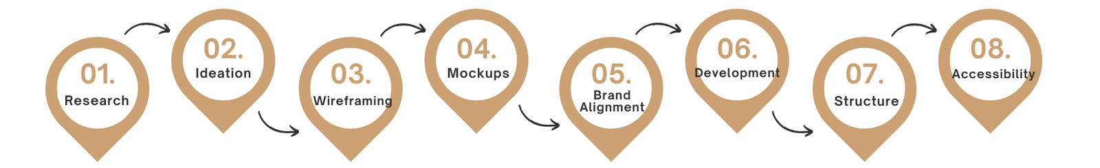
User Research: Summary:
To inform the design, I conducted initial stakeholder interviews and gathered feedback from internal teams who frequently interacted with RMCorp's clients.
- B2B clients wanted clarity on RMCorp's offerings without navigating multiple sites.
- Users valued quick access to company information, contact details, and project portfolios.
- Branding needed to feel professional and trustworthy while remaining clean and minimal.
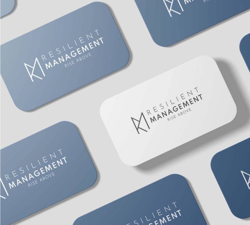
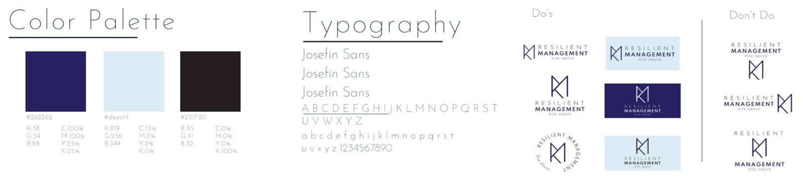
Brand Guideline
client provided a logo and core brand elements, including primary colors and font preferences. I expanded on this by creating a consistent visual language across the website — covering typography, spacing, icon usage, and component styling.
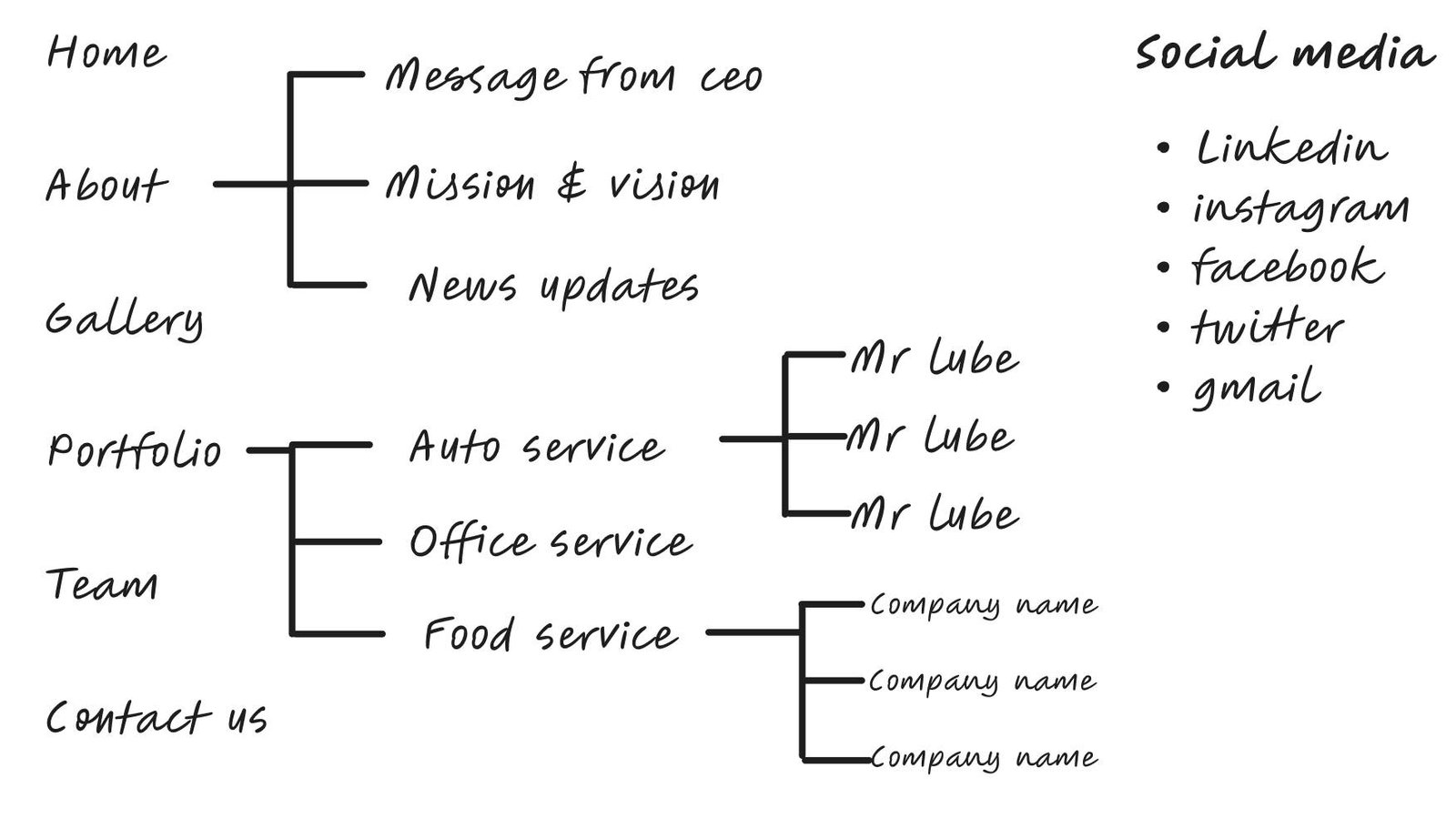
Information Architecture
I developed an information architecture to better understand the steps users might take to accomplish their goals with a low error rate in order to gain a better understanding of how users will navigate and use the information.
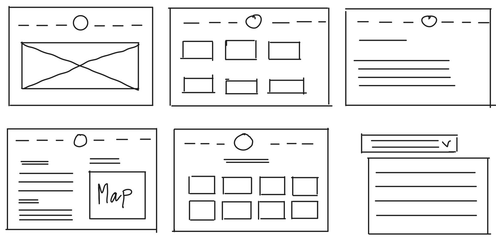
Mind on paper - Sketches:
Based on research, it came to attention that it was important to introduce the users to what is Placemaking. So I introduced an on-boarding experience of the website. Below are some of the sketches:
High-fidelity Figma prototype
In building wireframes, I ensure a consistent and user-centric flow of movement throughout the process. So I used Balsamiq Mockups to quickly create low-fidelity mobile and desktop prototypes. Click here for final prototype.