Achieving a 30% spike in order conversation rates post-launch
As a UX Designer, I tackled high-priority issues by redesigning the website and Decreased bounce rate within 6 sprints.
Problem:
We encountered a critical issue where customers were leaving the website due to disorganized content and an unattractive design. This led to an increased bounce rate and a decline in conversion rate. Users expressed frustration because scrolling through the product required three separate clicks, causing confusion and prompting them to abandon the site.
No Search option
Unorganized content
Misplace of sections
Solution:
After conducting usability tests and interviewing frequent users, I identified the root cause and allocated a sprint to address it. However, the initial solution—making changes to the existing landing page—proved unsustainable, requiring frequent updates and creating code dependencies. After extensive discussions, we decided to rebuild the landing page from scratch. This new version was developed and implemented within an additional sprint.
Impact:
The redesigned landing page resulted in a remarkable 30% increase in order rates. By streamlining the content, organizing details, and incorporating visually appealing elements, users enjoyed an improved navigation experience. This made them more likely to complete their purchases, driving a significant positive impact on key business metrics.
My Role:
I conducted user research to understand how to keep users engaged on the landing page and identify their expectations when they visit the site. Based on the findings, I created a user flow and designed low-fidelity wireframes. After refining and nearly finalizing the screens with the low-fidelity wireframes, I moved on to creating high-fidelity designs. To validate the app design, I conducted a moderated usability study with six participants. The study helped me identify common patterns and improve my designs. The results were highly successful, with 100% of tasks completed as intended, and each participant was able to accomplish their task exactly as I had anticipated.
Process:
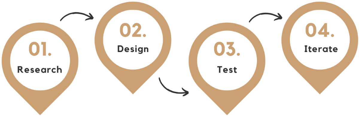
User Research: Summary:
I started by identifying the study goal and drafting a document with questions to understand the user better. That helps me comprehend their requirements and those of the users for whom I will be building. Following the user interview with the stakeholders and team, I evaluated each insight and selected a handful of insights that would be the most beneficial to address, such as adding search and cart buttons in the header section, adding user profile features, and creating a trusted brand by adding proof of brand presence.
Mind on paper - Sketches:
Based on research, it came to attention that it was important to introduce the users to what is Placemaking. So I introduced an on-boarding experience of the website. Below are some of the sketches:
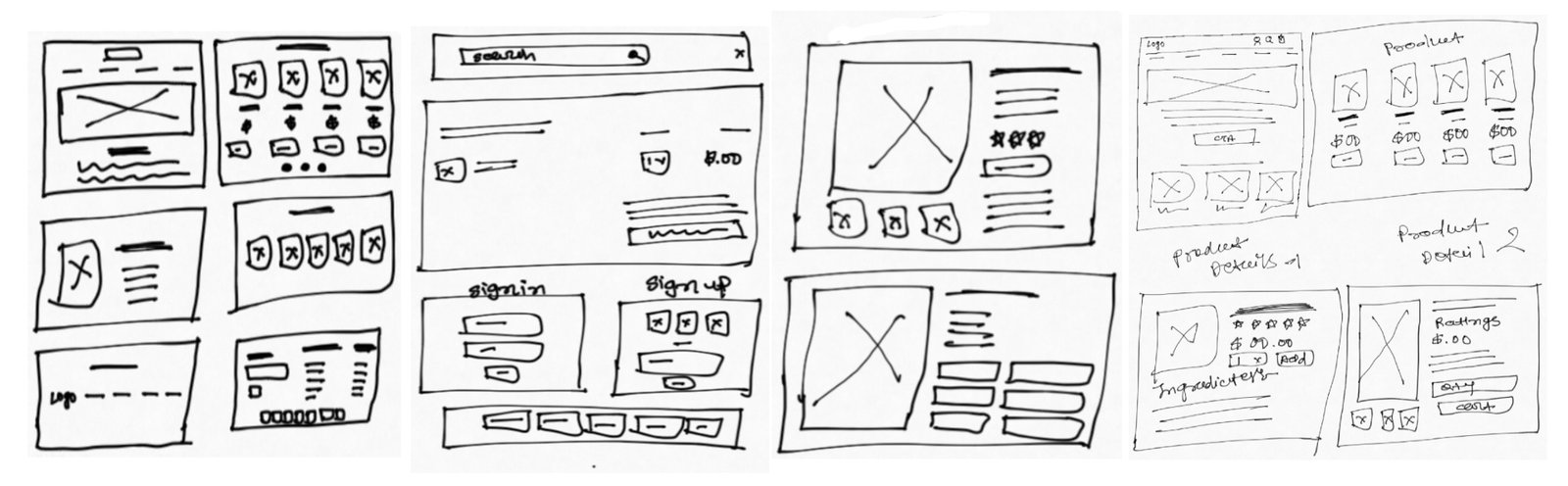
User Testing - Low-fidelity wireframes:
In building wireframes, I ensure a consistent and user-centric flow of movement throughout the process. So I used Balsamiq Mockups to quickly create low-fidelity mobile and desktop prototypes. Below is one of the wireframe:
Initial website designs:
Final Avatar:
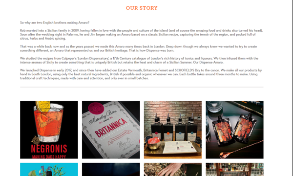
Let's dive deeper - Product List Design
before
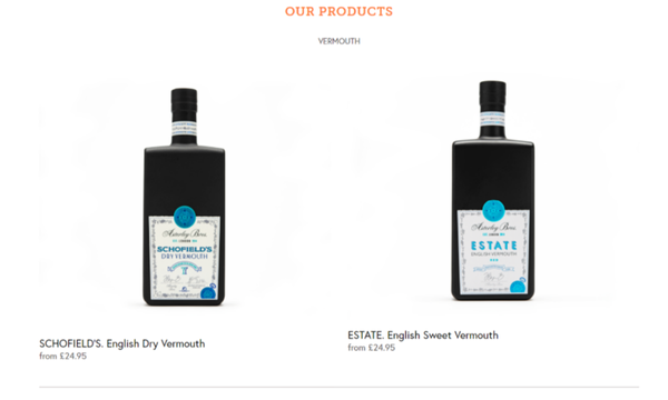 Problem Statement
The product listing page lacks sufficient details to provide users with the necessary product information. Currently, the page only displays the item name and price, leaving users without key details such as product description, features, or specifications. This minimal information can lead to a lack of engagement, reduced confidence in purchasing decisions, and higher bounce rates as users may leave the site to search for more information elsewhere.
Problem Statement
The product listing page lacks sufficient details to provide users with the necessary product information. Currently, the page only displays the item name and price, leaving users without key details such as product description, features, or specifications. This minimal information can lead to a lack of engagement, reduced confidence in purchasing decisions, and higher bounce rates as users may leave the site to search for more information elsewhere.
after
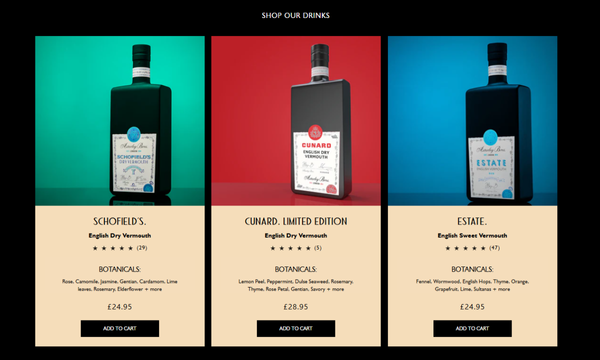 Solution
I identified the lack of product details as a key barrier to user engagement and decision-making. To address this, I redesigned the product listing to provide users with more comprehensive and visually appealing information. Product Ratings, Key Features, Call-to-Action Button, Enhanced Visual Appeal. This redesign aimed to improve user engagement by offering the critical information users need to make confident purchasing decisions while enhancing the overall user experience.
Solution
I identified the lack of product details as a key barrier to user engagement and decision-making. To address this, I redesigned the product listing to provide users with more comprehensive and visually appealing information. Product Ratings, Key Features, Call-to-Action Button, Enhanced Visual Appeal. This redesign aimed to improve user engagement by offering the critical information users need to make confident purchasing decisions while enhancing the overall user experience.
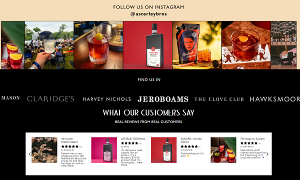
Credibility and trust-building elements
before
 Problem Statement
The website lacked credibility and trust-building elements, as there were no clear indications of proof of business. Users were unable to verify the authenticity of the brand, which led to hesitation in making purchases. The absence of testimonials, social media links, and partnerships with other reputable brands further contributed to this issue.
Problem Statement
The website lacked credibility and trust-building elements, as there were no clear indications of proof of business. Users were unable to verify the authenticity of the brand, which led to hesitation in making purchases. The absence of testimonials, social media links, and partnerships with other reputable brands further contributed to this issue.
after
 Solution
To solve this, I made several updates to the website as part of the redesign: Testimonials, Social Media Links, Trusted Brands, and media features. These additions were strategically designed to increase user trust, validate the authenticity of the business, and encourage purchase confidence.
Solution
To solve this, I made several updates to the website as part of the redesign: Testimonials, Social Media Links, Trusted Brands, and media features. These additions were strategically designed to increase user trust, validate the authenticity of the business, and encourage purchase confidence.