“Human-centered solutions designed with clarity, care, and purpose.”
Enhances social connection between users and emerging comedians
Design a platform that brings people together through laughter, making comedy more social and connected — no matter the distance.
Problem:
Despite the rising popularity of stand-up comedy and an expanding pool of talented comedians, the current entertainment app landscape lacks a dedicated platform focused solely on comedy. This gap limits exposure for emerging artists and leaves audiences without a centralized hub for diverse comedic content. As demand grows for easily accessible, laughter-driven entertainment, there's a clear need for a platform that brings together comedians and comedy lovers - fostering discovery, connection, and community in the comedy space.
Solution:
Design a digital platform that serves as a one-stop destination for all things comedy — including stand-up specials, comedy movies, skits, memes, short clips, and live event bookings. The platform will cater to a wide range of users by offering both curated content and personalized recommendations. It will also support emerging comedians by giving them a space to showcase their talent and connect with a broader audience, ultimately making comedy more accessible, social, and connected.
My Role:
I led the end-to-end UX design process for the comedy OTT app — starting with user research, competitive analysis, and persona creation. I mapped user journeys, built task flows, and structured the information architecture. I created low to high-fidelity wireframes, designed the UI, and developed an interactive prototype. I also conducted usability testing to validate and refine the experience.
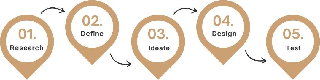
Process:
User Research Summary:
To better understand user needs, motivations, and behaviors, I conducted user research using both qualitative and quantitative methods. These insights helped shape the direction of the product and informed key design decisions.
Qualitative Research
I conducted 17 one-on-one interviews with participants from diverse backgrounds — including IT, food, pharmaceutical, design, and education industries, as well as university students. This helped gather a wide range of perspectives and uncover common patterns in how users engage with comedy content.
Interview Questions
- Can you tell me your name and what you do for a living?
- What are your hobbies or interests? How do you usually spend your free time?
- What does entertainment mean to you personally?
- Do you enjoy comedy? If yes, what types or genres do you like the most?
- What's your favorite comedy show and why?
- Where do you usually watch comedy content (e.g. mobile, TV, laptop)? Any reason for your choice?
- Do you have an all-time favorite comedy movie or web series? What do you love about it?
- Who is your favorite stand-up comedian and what do you like about their style?
- Have you ever used a platform that focuses only on comedy? If yes, what was your experience?
- How would you feel about having a dedicated platform just for comedy content?
- What are your thoughts on a feature that lets you watch comedy shows virtually with friends and see their live reactions?
- Do you have any suggestions on what features or types of content should be included in such a platform?
Interview INSIGHTS
- User 1: I keep switching between YouTube, Instagram, and other OTT platforms just to find the comedy I enjoy. Having one dedicated place for all types of comedy content would make things so much easier.
- User 2: There should be clear categories like light, daily, and family humor. Since the app's core purpose is to make people laugh, it needs to keep users engaged from the start.
- User 3: It would be great to see comedy organized by genre — it helps us discover new types of humor we might not usually explore.
- User 4: Content should be personalized based on user interests, followed by smart recommendations. This could be done by understanding user preferences.
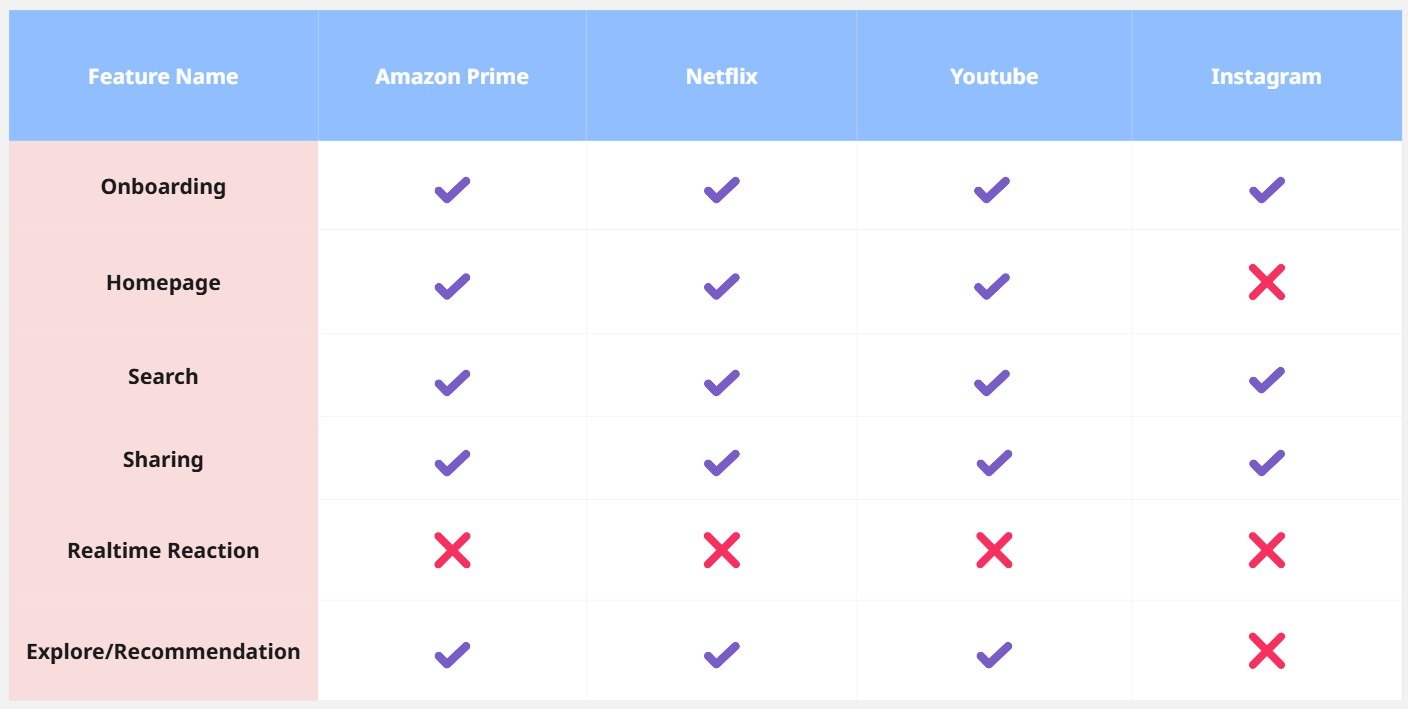
COMPETITIVE ANALYSIS
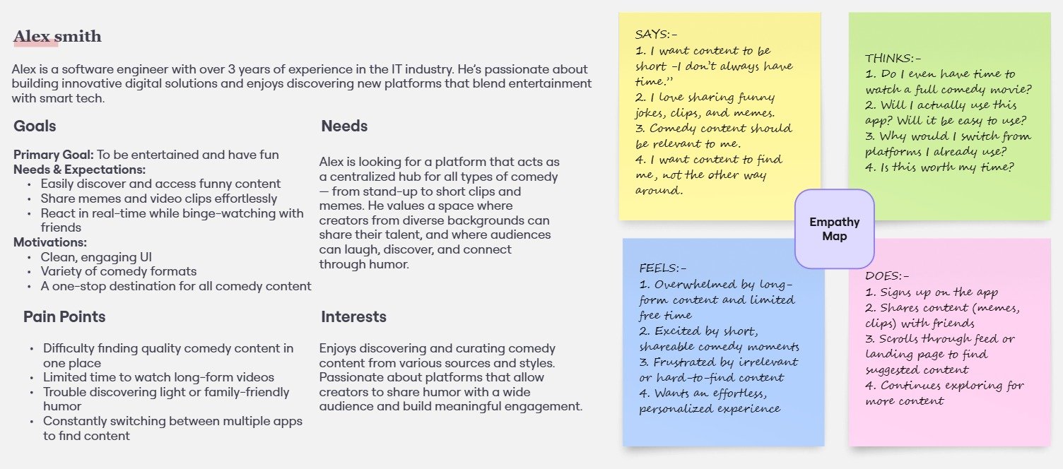
USER PERSONA
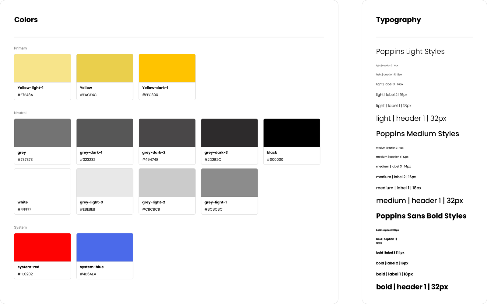
Brand Guideline
client provided a logo and core brand elements, including primary colors and font preferences. I expanded on this by creating a consistent visual language across the website — covering typography, spacing, icon usage, and component styling.
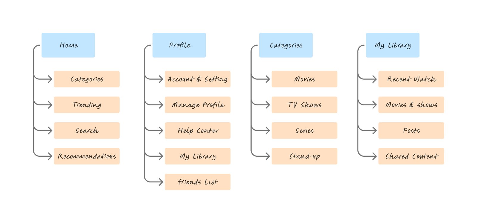
Information Architecture
I developed an information architecture to better understand the steps users might take to accomplish their goals with a low error rate in order to gain a better understanding of how users will navigate and use the information.
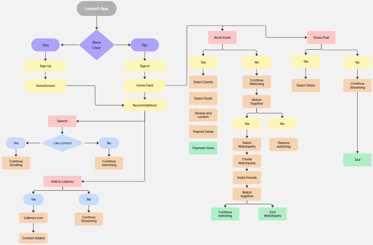
User Flow
To prevent users from becoming trapped while interacting with the product, I built a user flow. I considered users and how they would engage with completing a particular task when I was constructing.
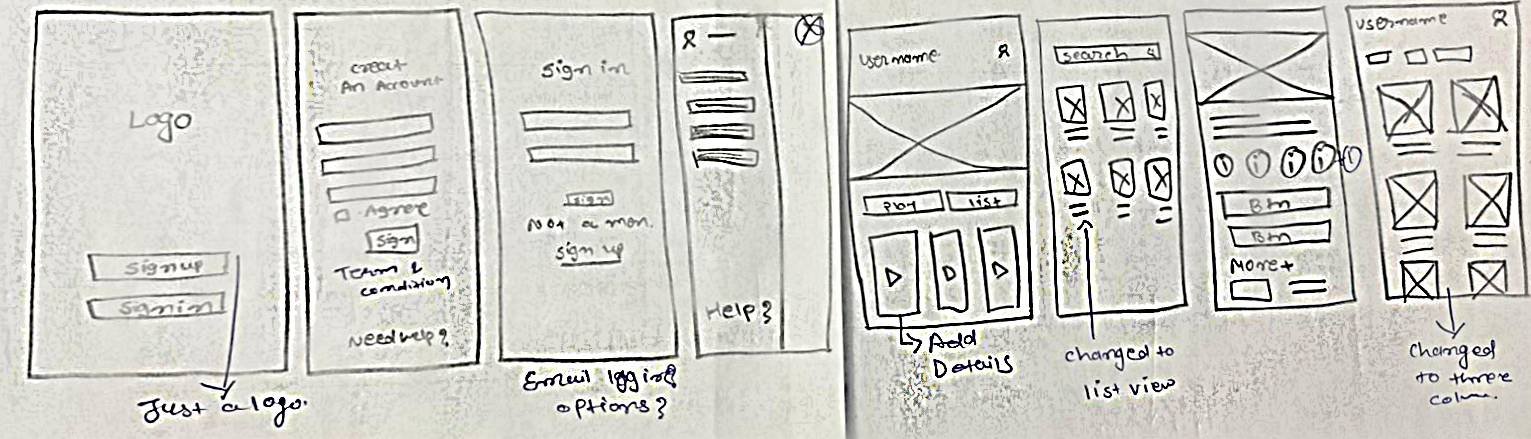
Mind on paper - Sketches:
Based on research, it came to attention that it was important to introduce the users to what is Placemaking. So I introduced an on-boarding experience of the website. Below are some of the sketches:
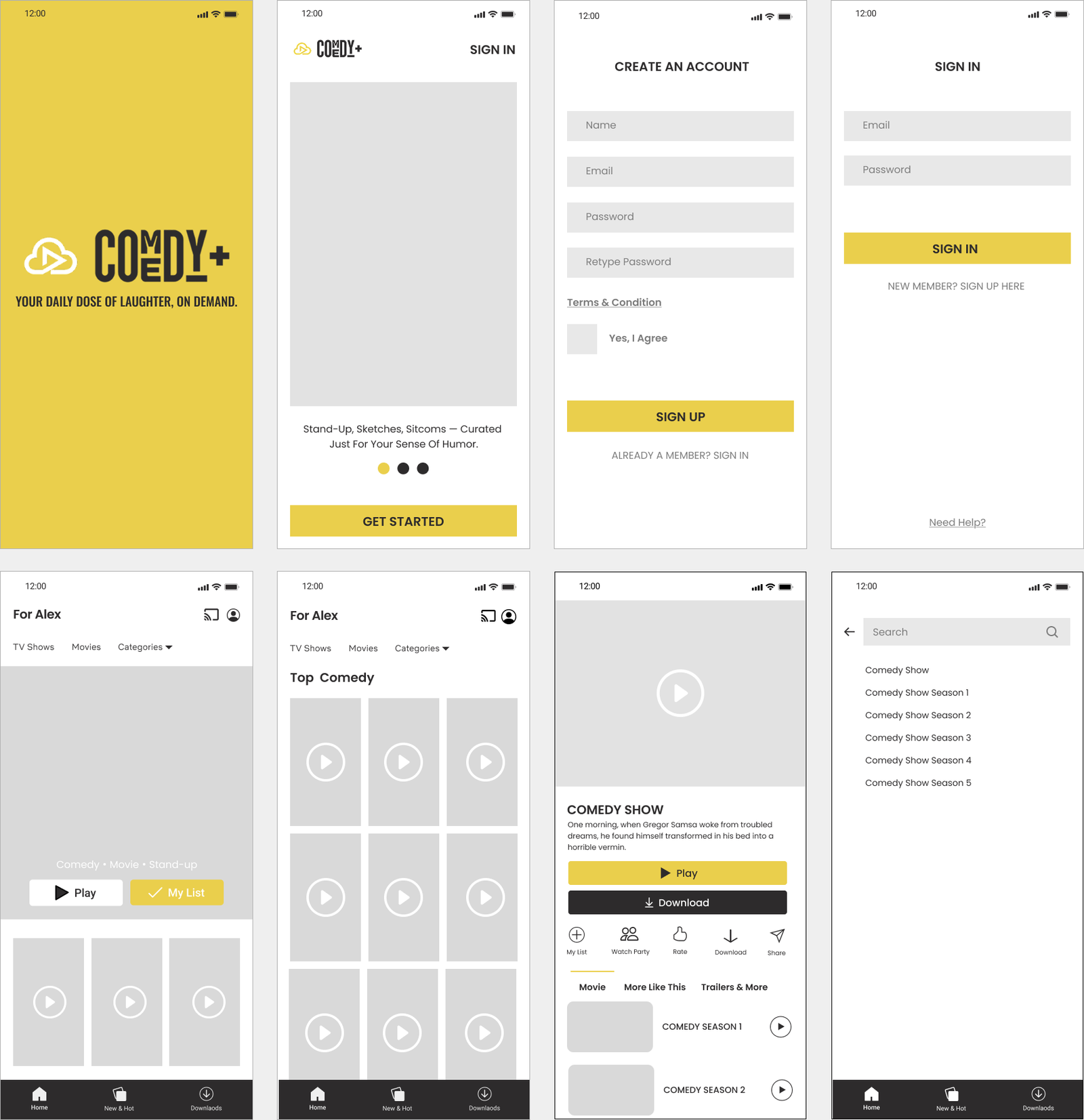
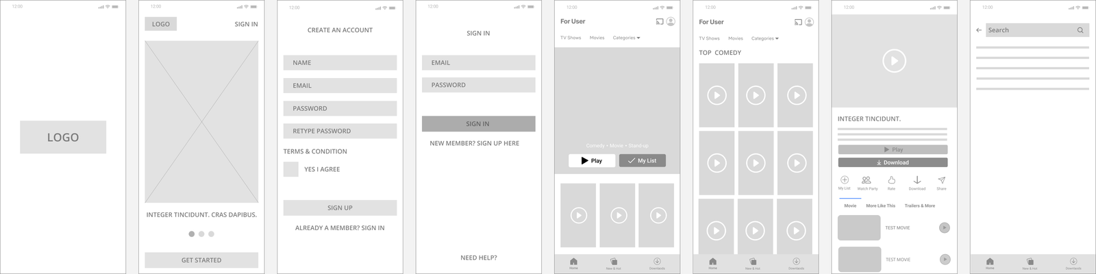
Low-fidelity wireframes:
In building wireframes, I ensure a consistent and user-centric flow of movement throughout the process. So I used figma to quickly create low-fidelity mobile and desktop prototypes. Below is few of the wireframe:
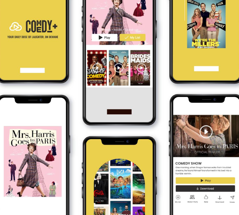
High-fidelity Figma prototype